OASIS
Concert Poster | Vintage Britpop / Zine Aesthetic
00

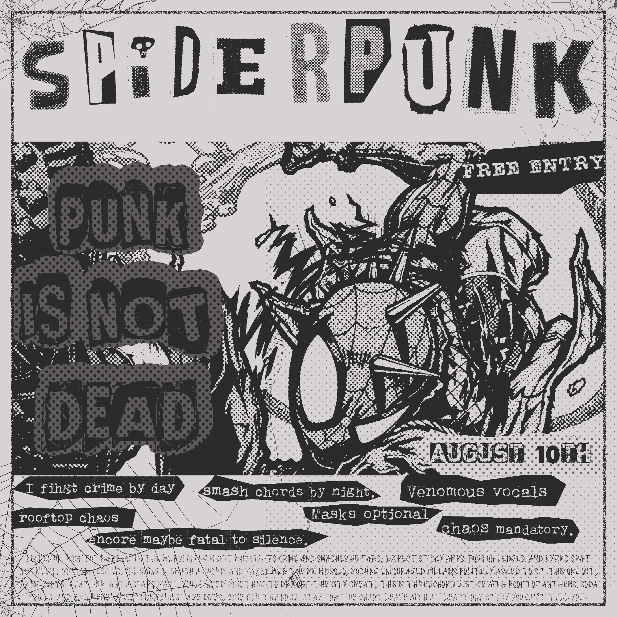
The task was to design a fictional concert poster for an Oasis performance in 1996 that looks like it was actually printed and stapled to a telephone pole in Manchester back then, not created in 2025. The challenge of designing vintage work is that authenticity is not a filter, it is a choice for every element.
The entire design is printed in a monochromatic scheme, meaning no color, no gradients, no digital sheen. The photographs are heavily grainy with halftone dots, and cut to a rough edge. The handwritten cutout with the Oasis lyrics "I'm feeling supersonic, give me gin and tonic" is a personal touch that no font can achieve. This is a deliberate decision to break up the grid.
The text hierarchy is simple and strict. OASIS is typeset vertically down the left side, DEFINITELY MAYBE dominates the bottom section, while the event details are presented cleanly in a sans-serif font reminiscent of a newspaper. The design is set on a slightly off-white background with a textured look, as if it was pulled directly out of a box in someone's attic.
What this shows a client: if your band, event, or venue wants a poster that doesn't look like every other digitally-produced gig flyer, but instead carries the weight of a real era — this is how it's done. The vintage approach works hardest when it's built from the inside out, not filtered on top.
year
2025
timeframe
2 days
tools
Photoshop
category
Personal Project