SPIDERPUNK
Concert Poster | Punk / Anarchic / Screen-Print Aesthetic
00
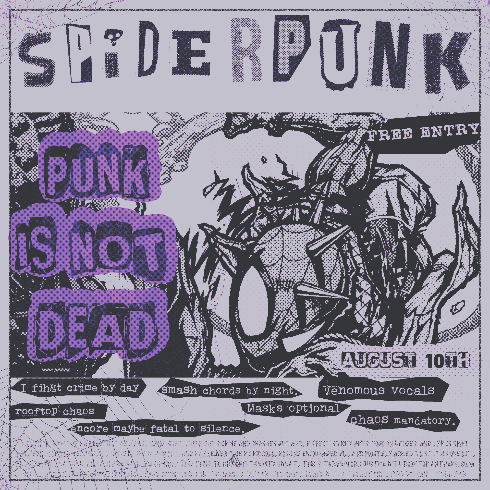
The two versions, one concept: that's the promise of a real design process. The first one was a color version, a specific palette of purple and black, selected because it's outside the normal red and black palette most designers will instinctively reach for, associated with the "punk" genre.
The second was a black and white version, not because the first one was a failure, but because many clients will want their work to be print-ready, costing less to produce.
A good designer will deliver both versions without being asked.
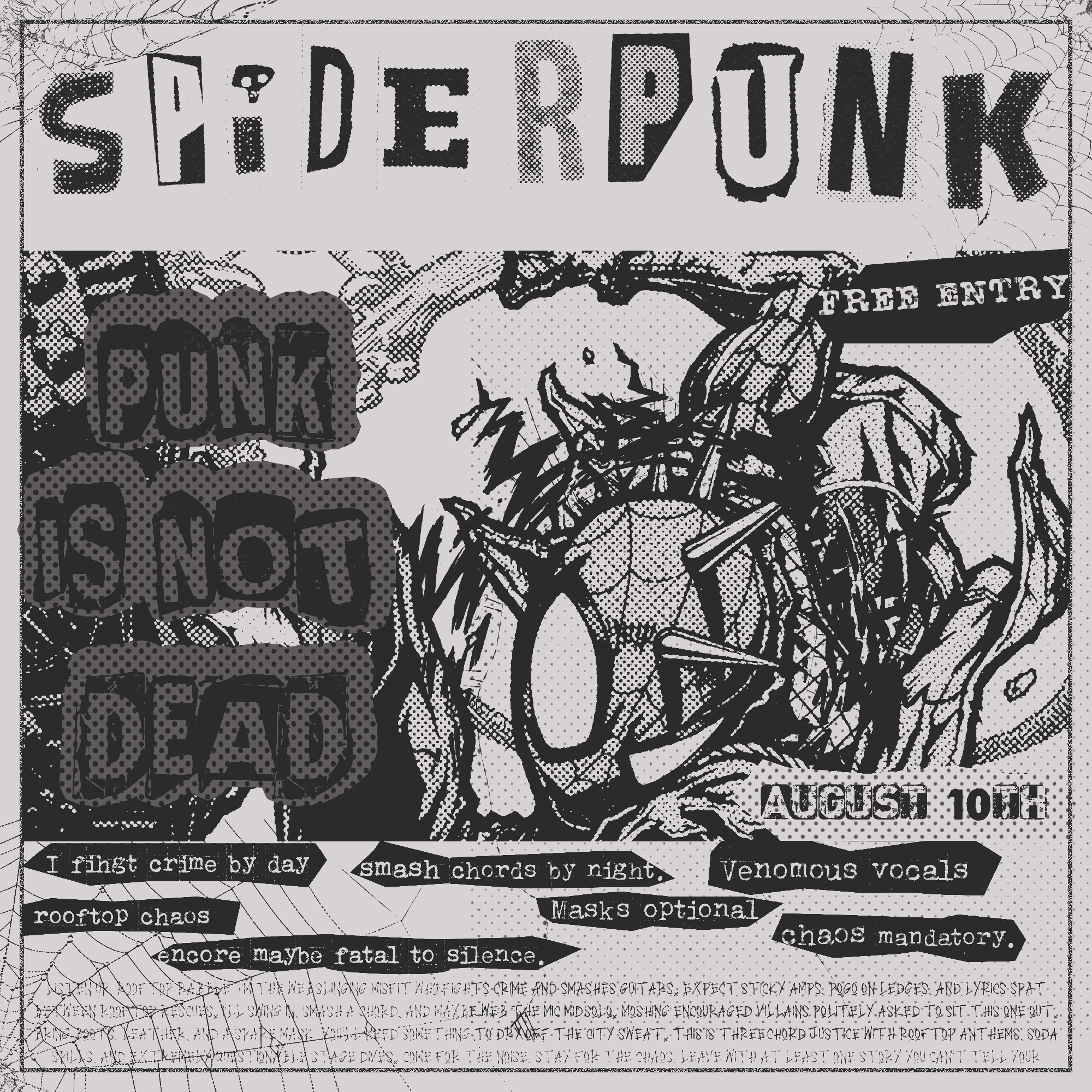
The composition is centered around a hand-drawn illustration of Spider-Punk in mid-scream, surrounded by texture of cobwebs that fades into the background.
The title "PUNK IS NOT DEAD" is a bubble letter stamp, the kind used by political activists, not a font.
The surrounding text is dense blocks of microcopy, again in a font inspired by anarchist pamphlets, chaotic enough to look authentic, ordered enough to read.
The border of hand-stamped pattern frames the entire composition like a broadsheet newspaper, the kind one might find at a 1977 London punk concert.
What this shows a client: if you're running a punk night, an underground show, a band with a raw aesthetic, or even a brand that wants to borrow the energy of rebellion — this is what intentional chaos looks like when someone actually knows what they're doing.
year
2025
timeframe
2 days
tools
Photoshop
category
Personal Project
01